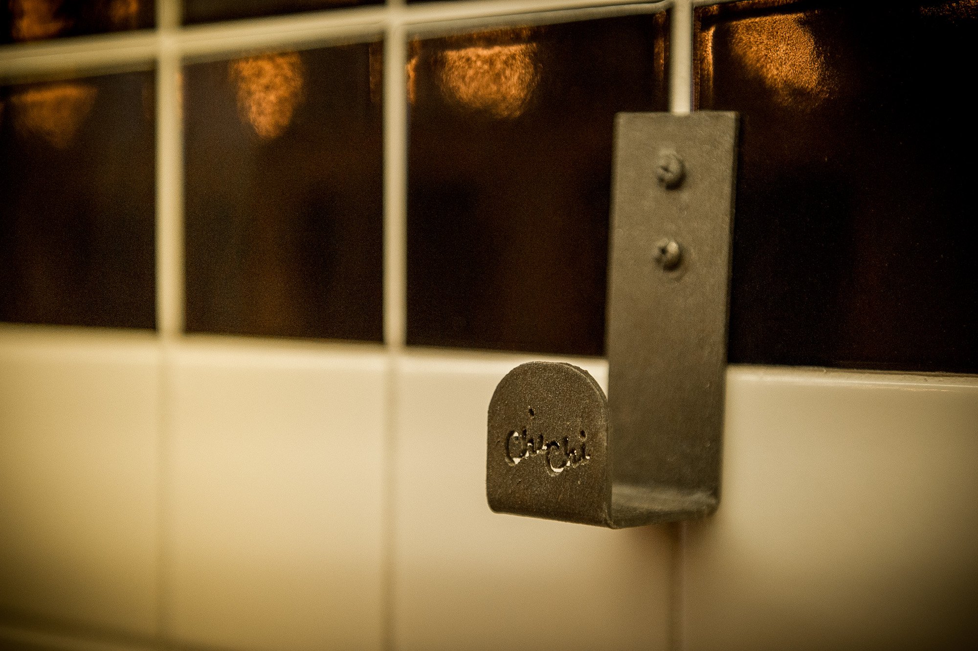
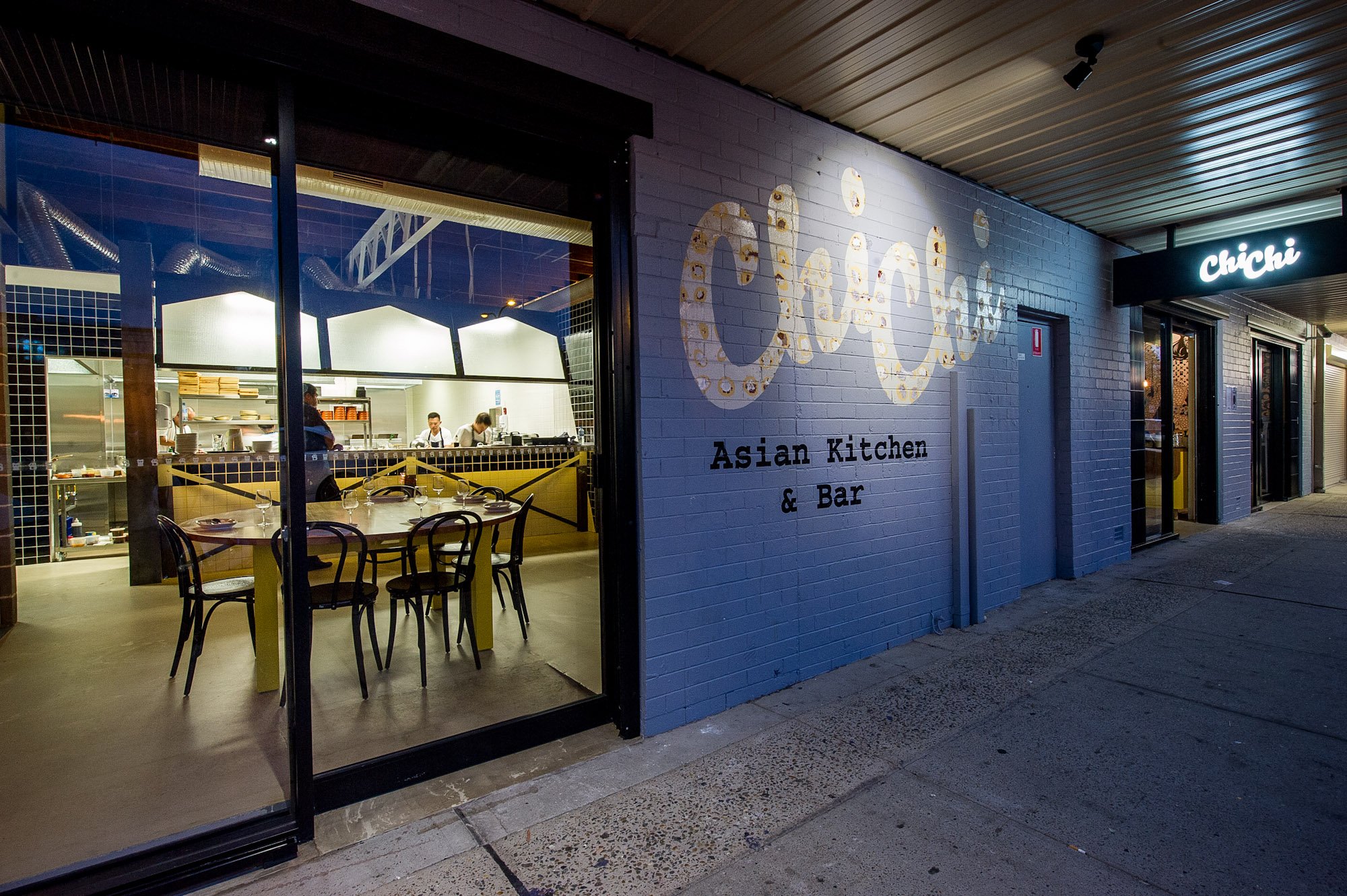
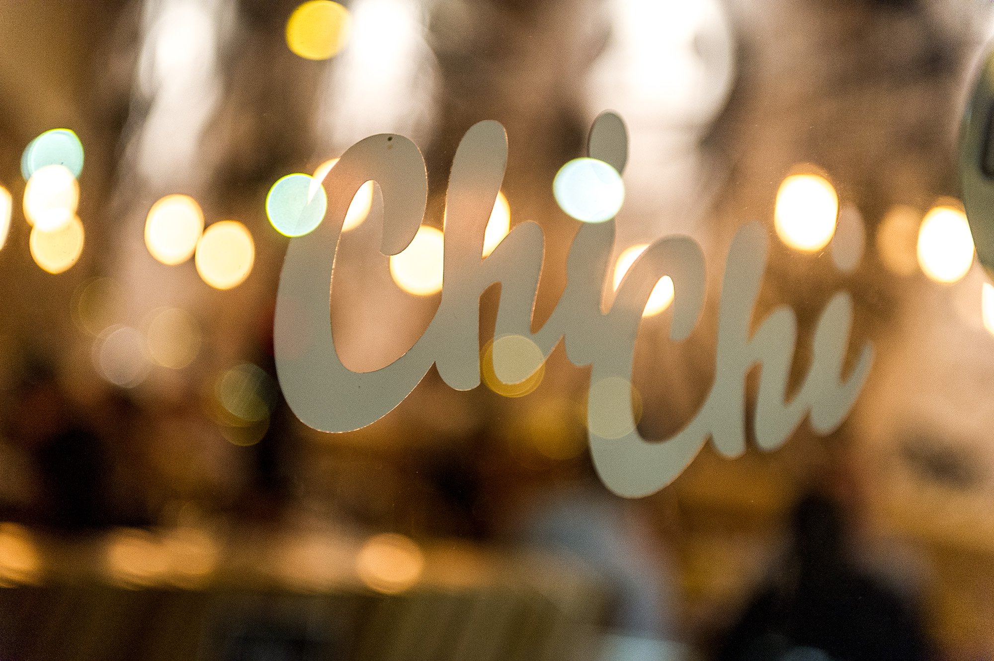
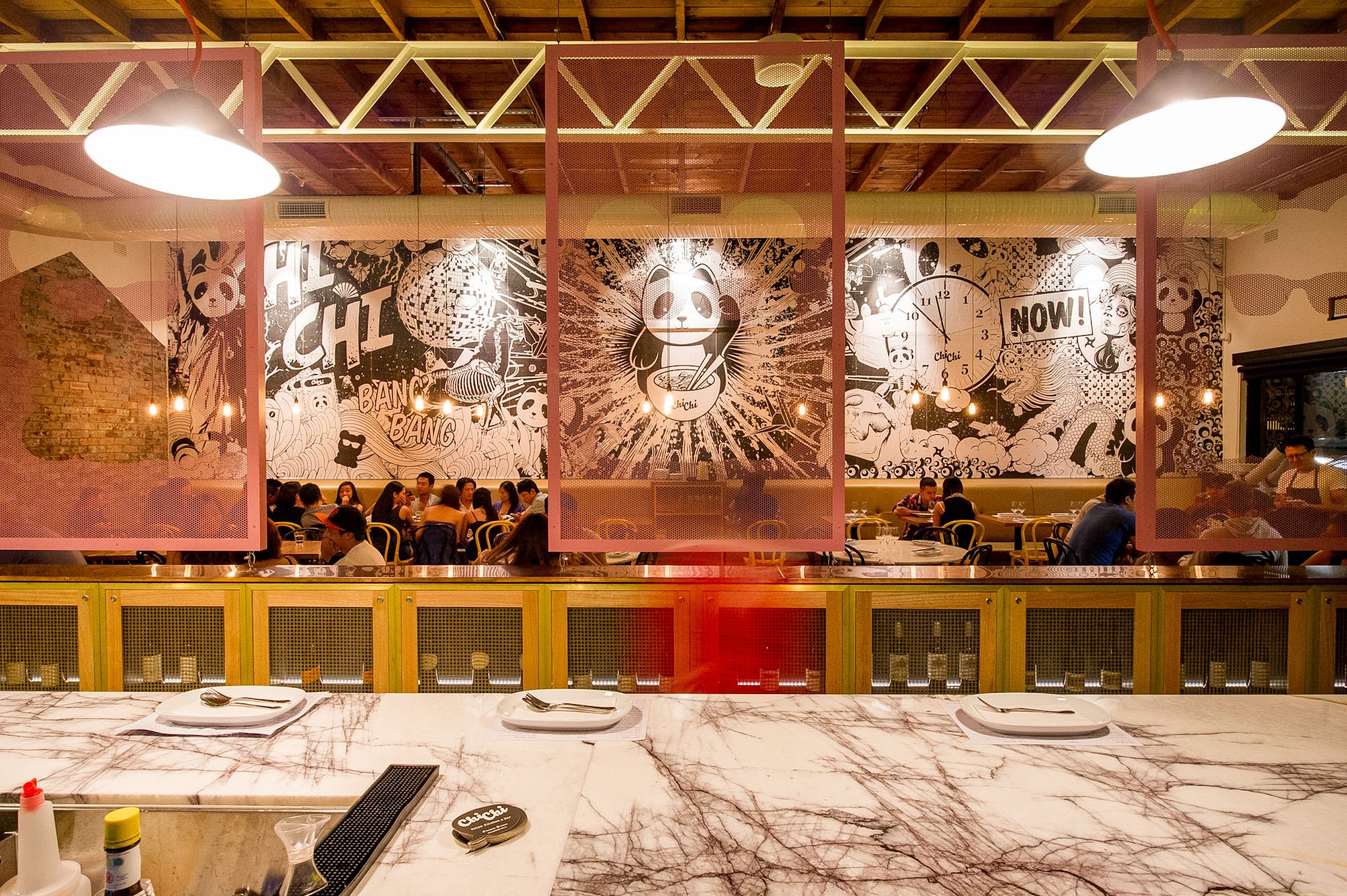
Chi Chi
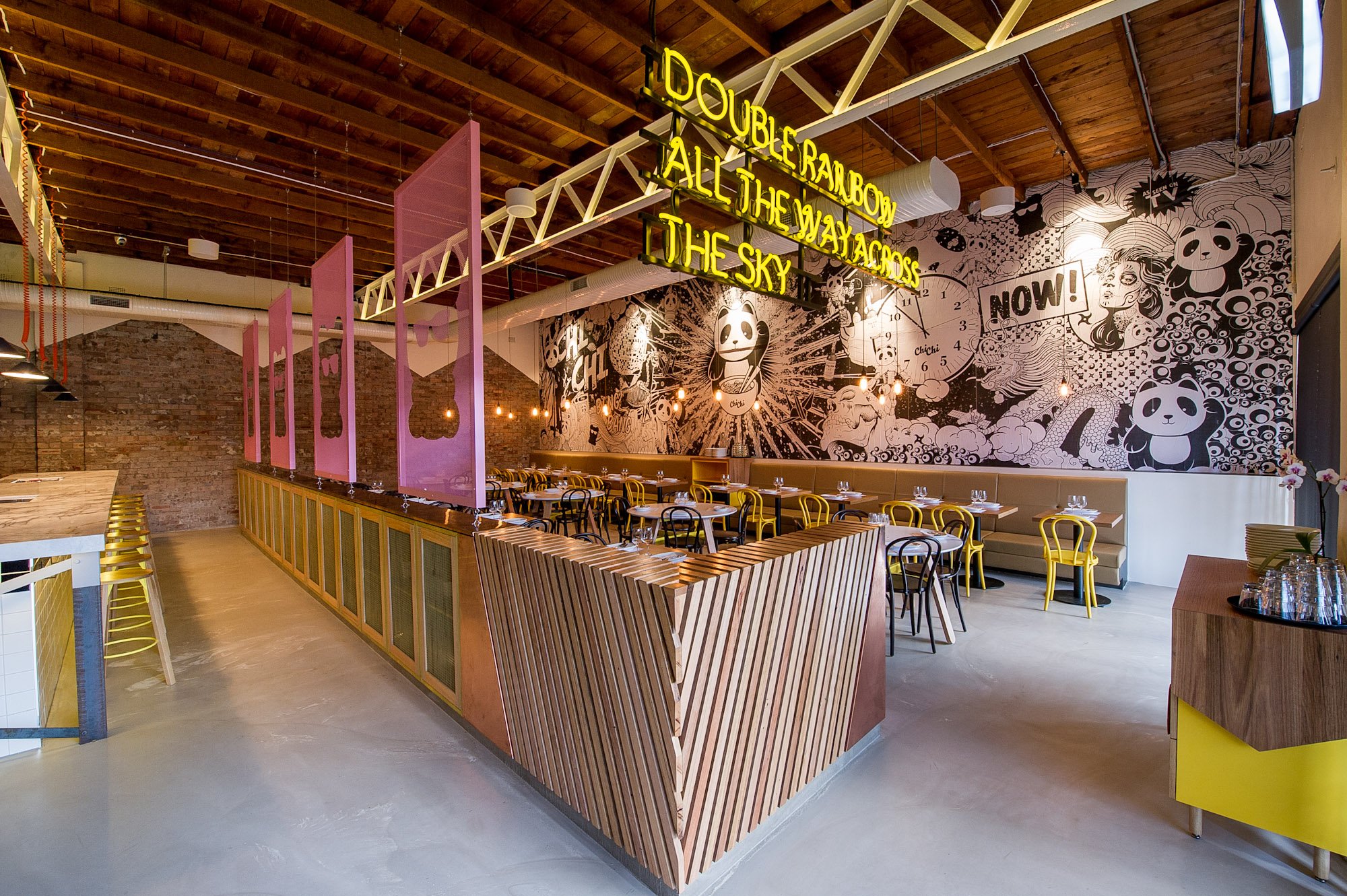
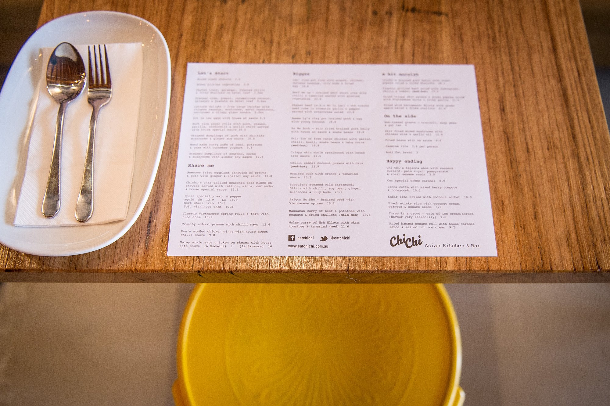
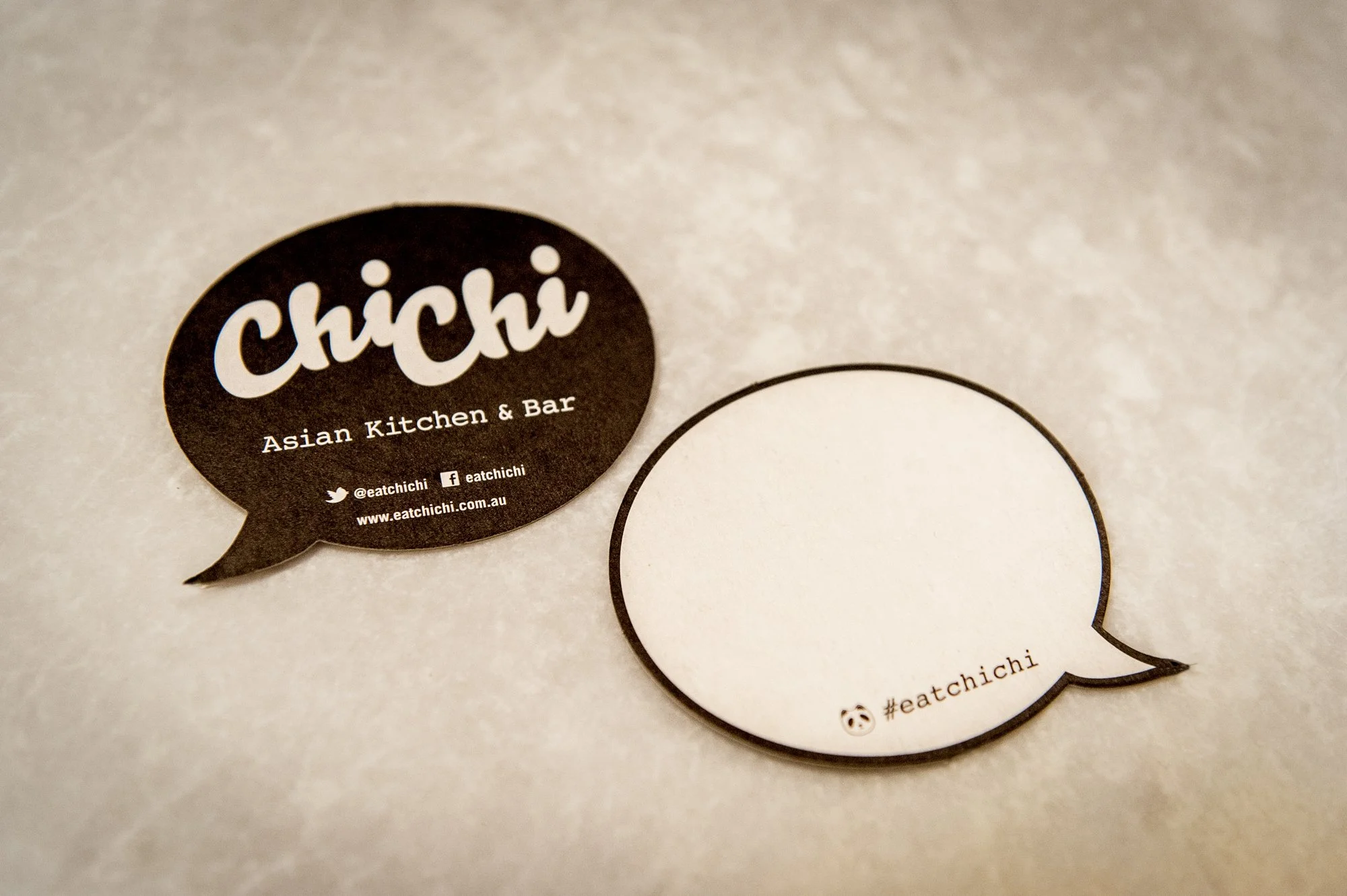
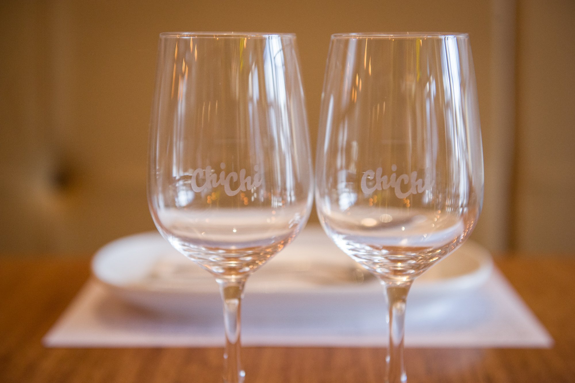
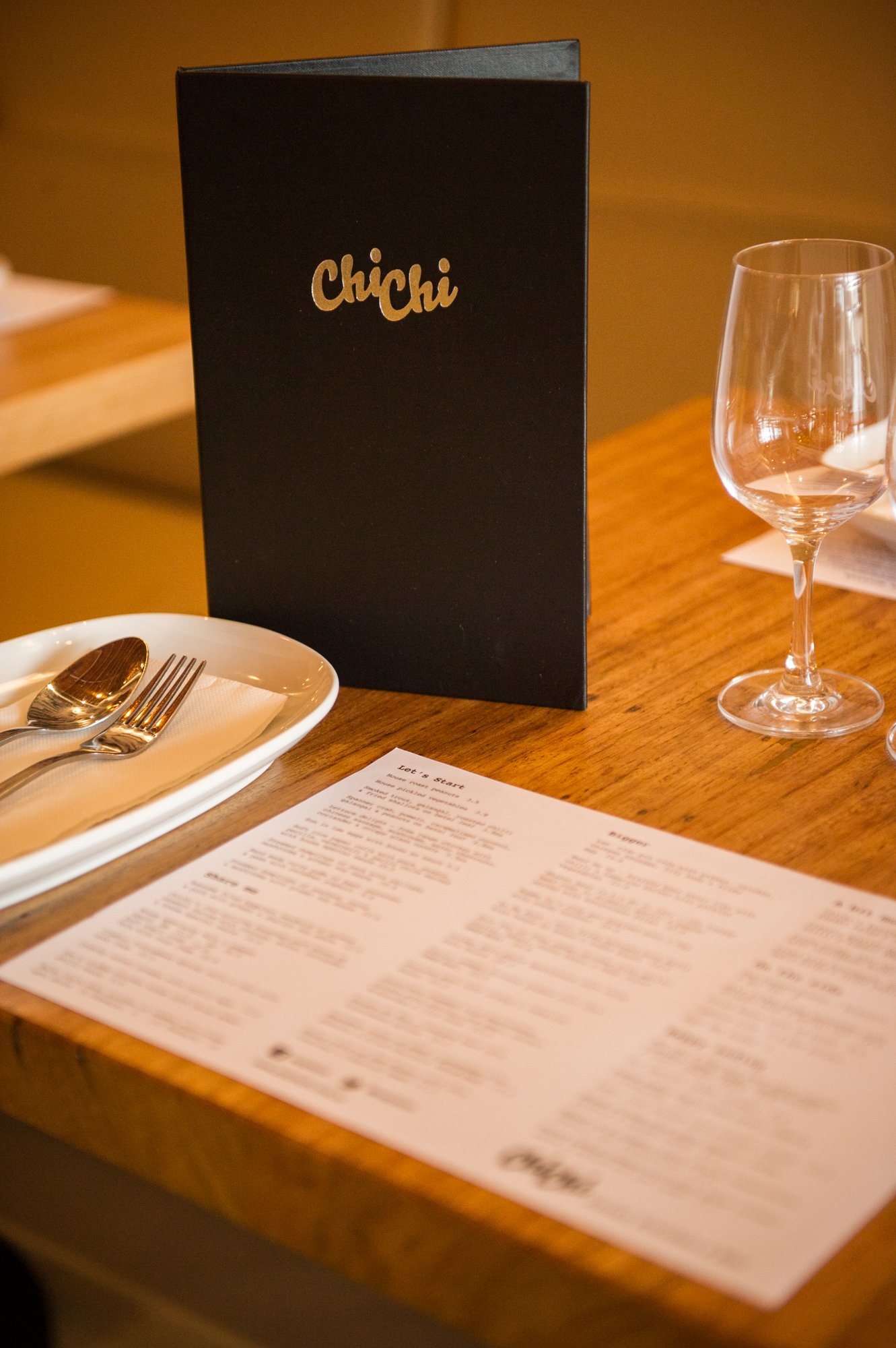
I collaborated with interior designer Matt Woods to brand a Western Suburbs restaurant inspired by the cool, inner Sydney eateries of that time. Working with another graphic designer, I took the logo he’d created and rolled out external and internal signage, uniforms, etched glassware, laser cut bag holders, custom shaped coasters, embossed menu folders, neon signage, plus I designed and installed a 12m x 4m wall mural.
I redesigned the wall mural after the first iteration was rejected by the client. I then had it printed and applied in the same techniques as traditional street paste ups. This included printing on architects paper. Hand making litres of wheat paste on the stove over night. The install took myself, Matt Woods and a helper 12 hours to do (watch the video below).
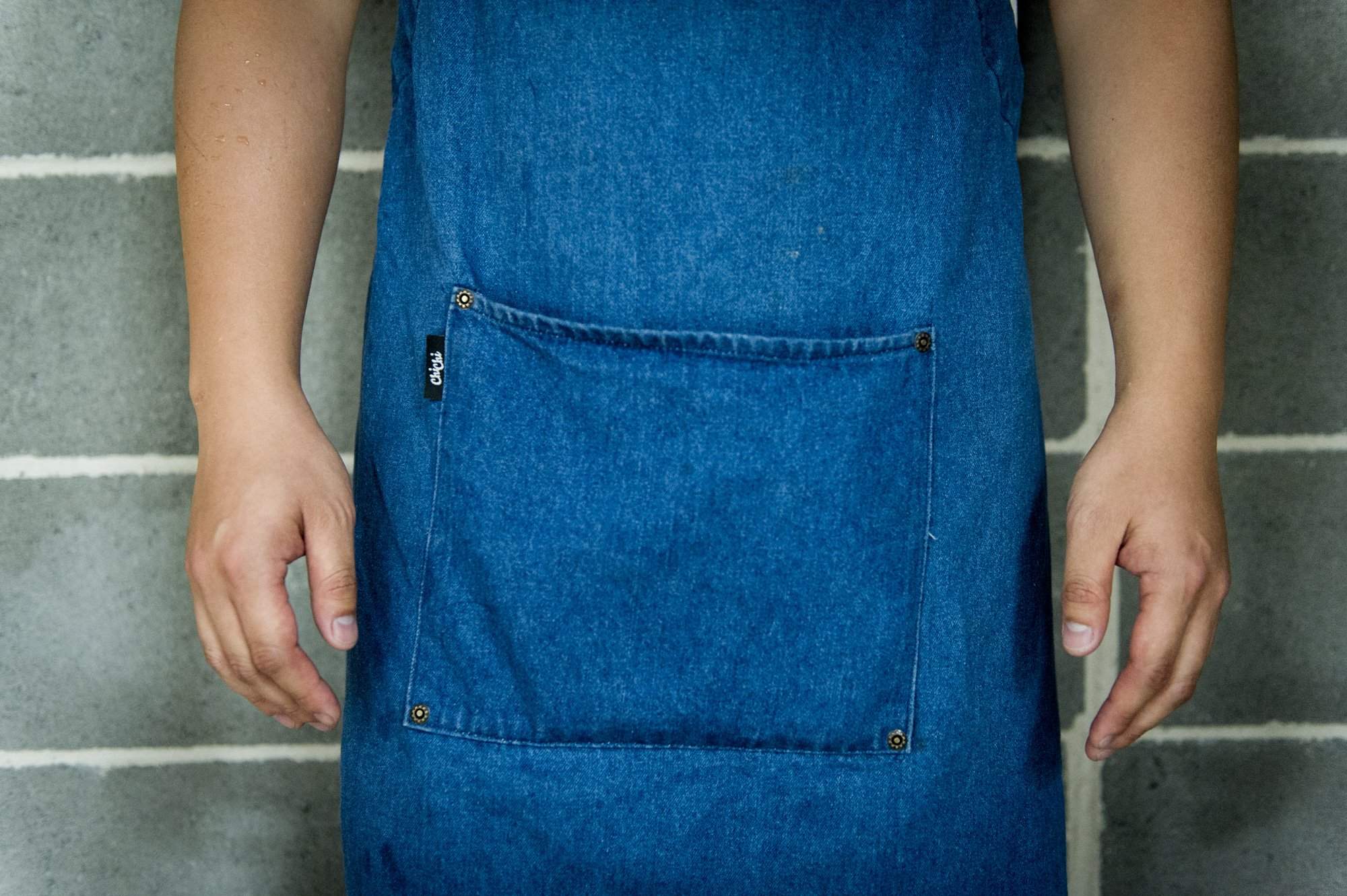
For the staff uniforms I had denim aprons made with Chi Chi labels and brass buttons, reminiscent of Levis. They also wore white t-shirts and black caps.
The neon sign was hand-made by a traditional neon sign maker, attached to a welded steel brace and hung in mid-air by cables. The text which referenced a popular meme at the time was meant to be a placeholder but the client loved it.
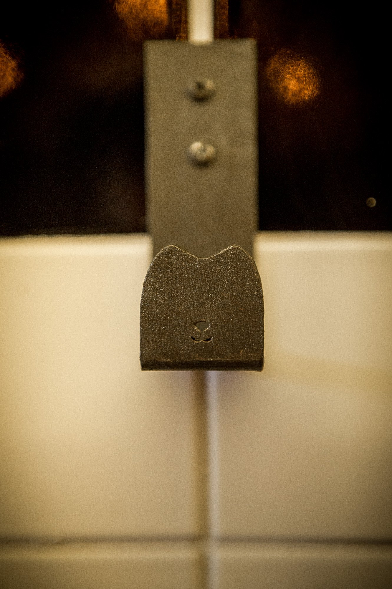
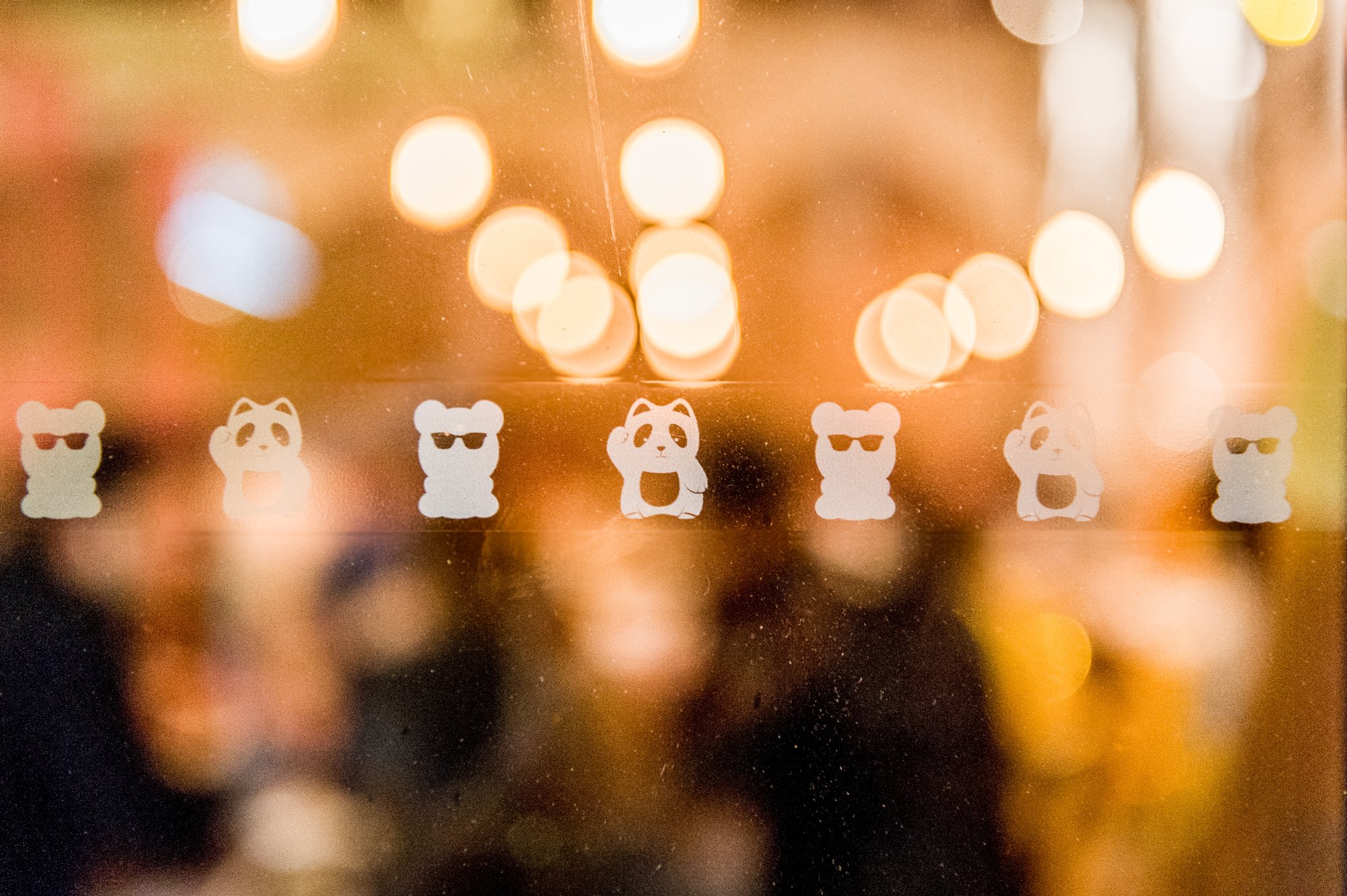
I used a stencil technique for the exterior signage, saving the raw brick wall while the rest of it was painted. Chi Chi logos and pandas in frosted decals were applied to the window glass.
Unfortunately the client didn’t listen to our advice to change the name (four alternative names with mood boards were presented) after we learned of a very popular Melbourne restaurant. Subsequently, a cease and desist letter was issued and they had to rebrand. Always listen to your designer!
All photos shot by me.